Estúdio Criativo Independente

Projetos
Especialidades
Estúdio
Vamos Conversar!


01 / CAVALIN DESIGN – IDENTIDADES EM MOVIMENTO

DESTAQUE / 02


Techneiras
[PT]
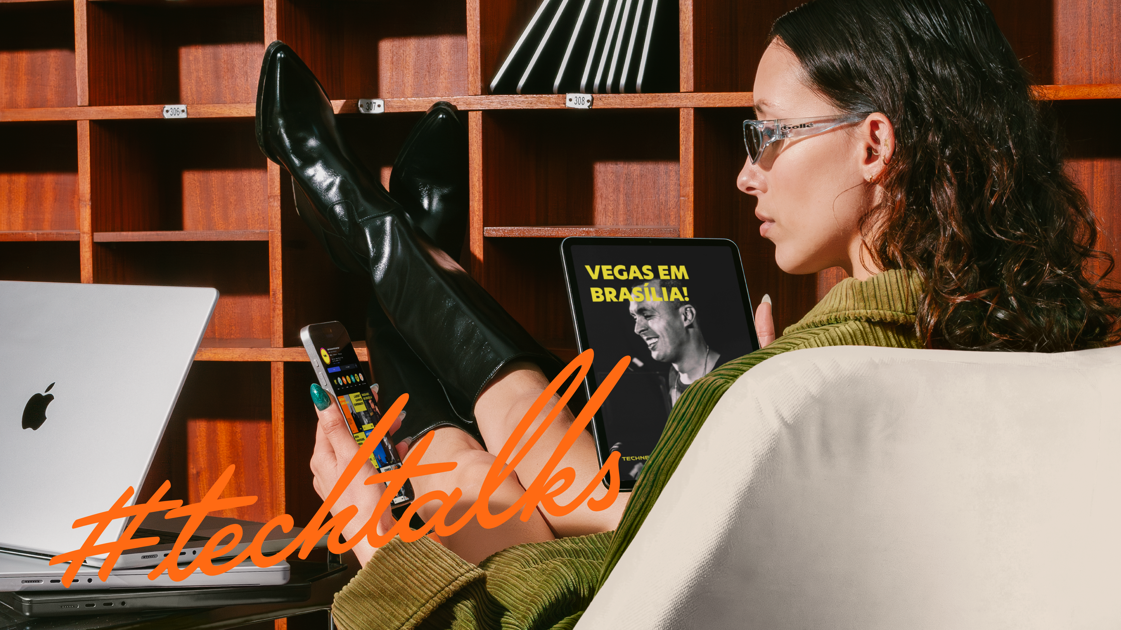
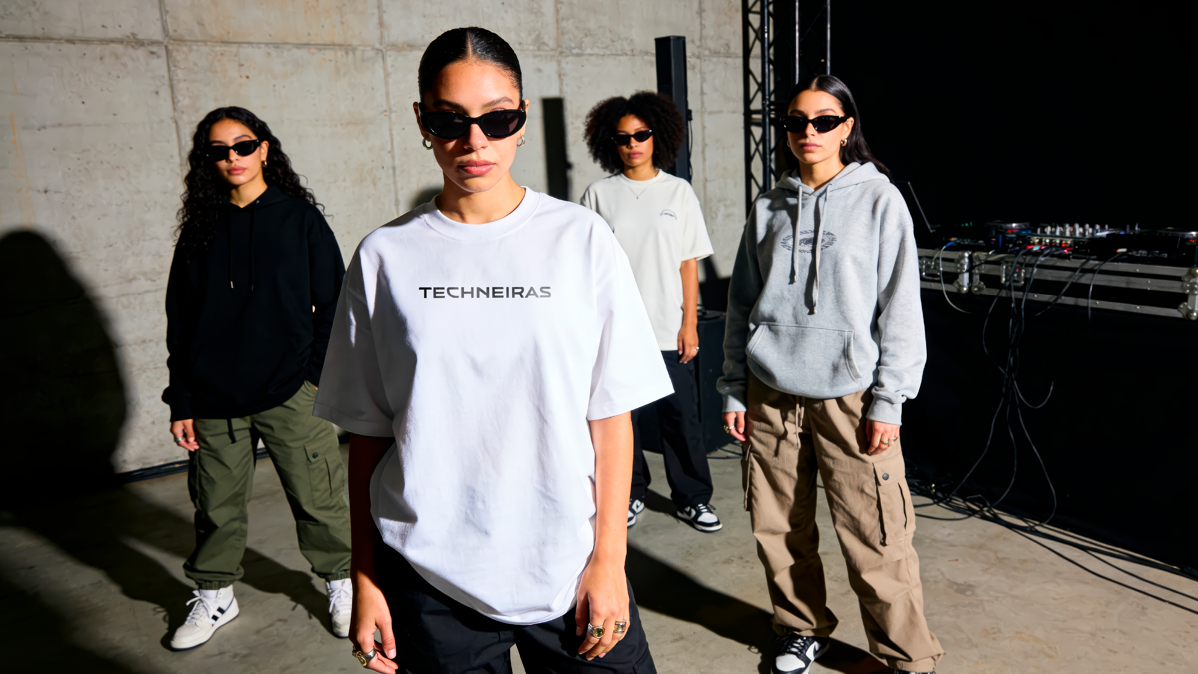
A Techneiras nasceu em Brasília, em março de 2024, como uma comunidade feminina de amantes da música eletrônica. Com o tempo, virou um hub criativo digital que reúne notícias, entretenimento e comunidade, conectando público, produtoras de eventos e marcas, com atenção especial às regiões fora do eixo SP/RJ.
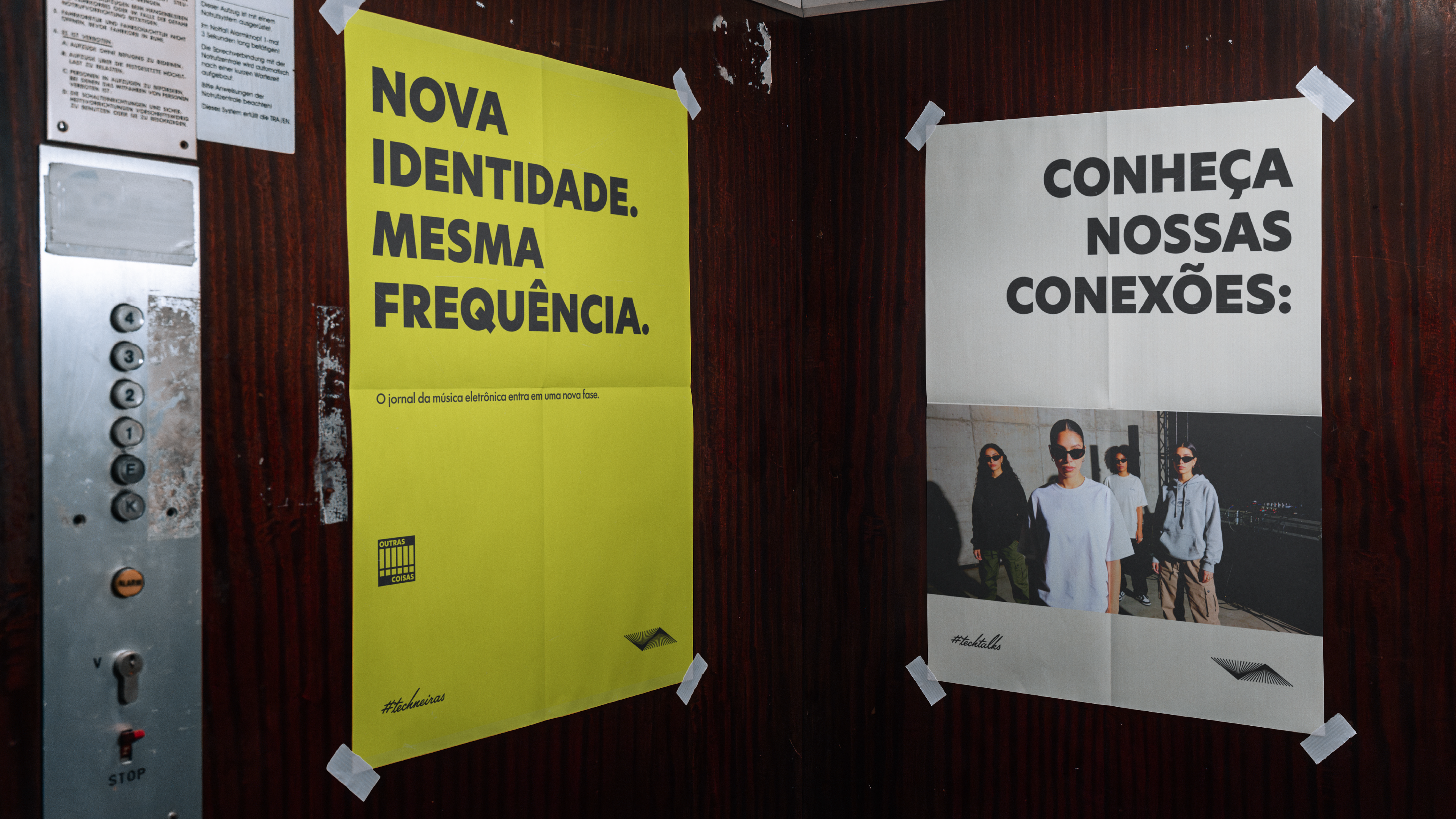
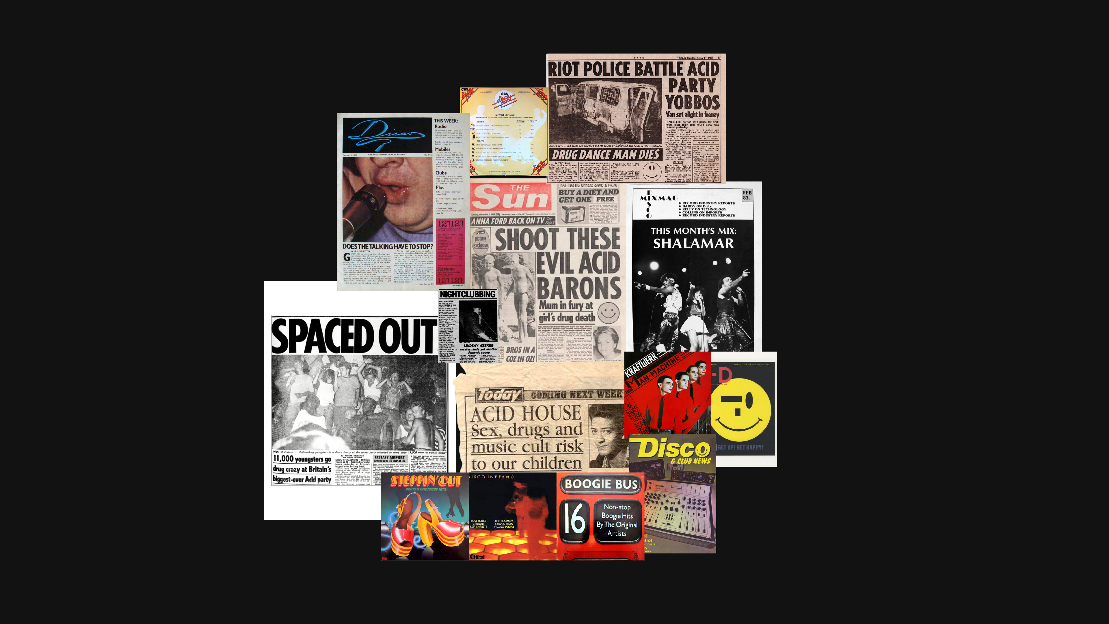
O desafio foi redesenhar a identidade para acompanhar essa evolução. A marca precisava deixar para trás os códigos femininos da fase anterior, como o roxo e o rosa, e se tornar neutra, inclusiva e profissional. Ao mesmo tempo, não podia perder a energia e o espírito underground da cena.
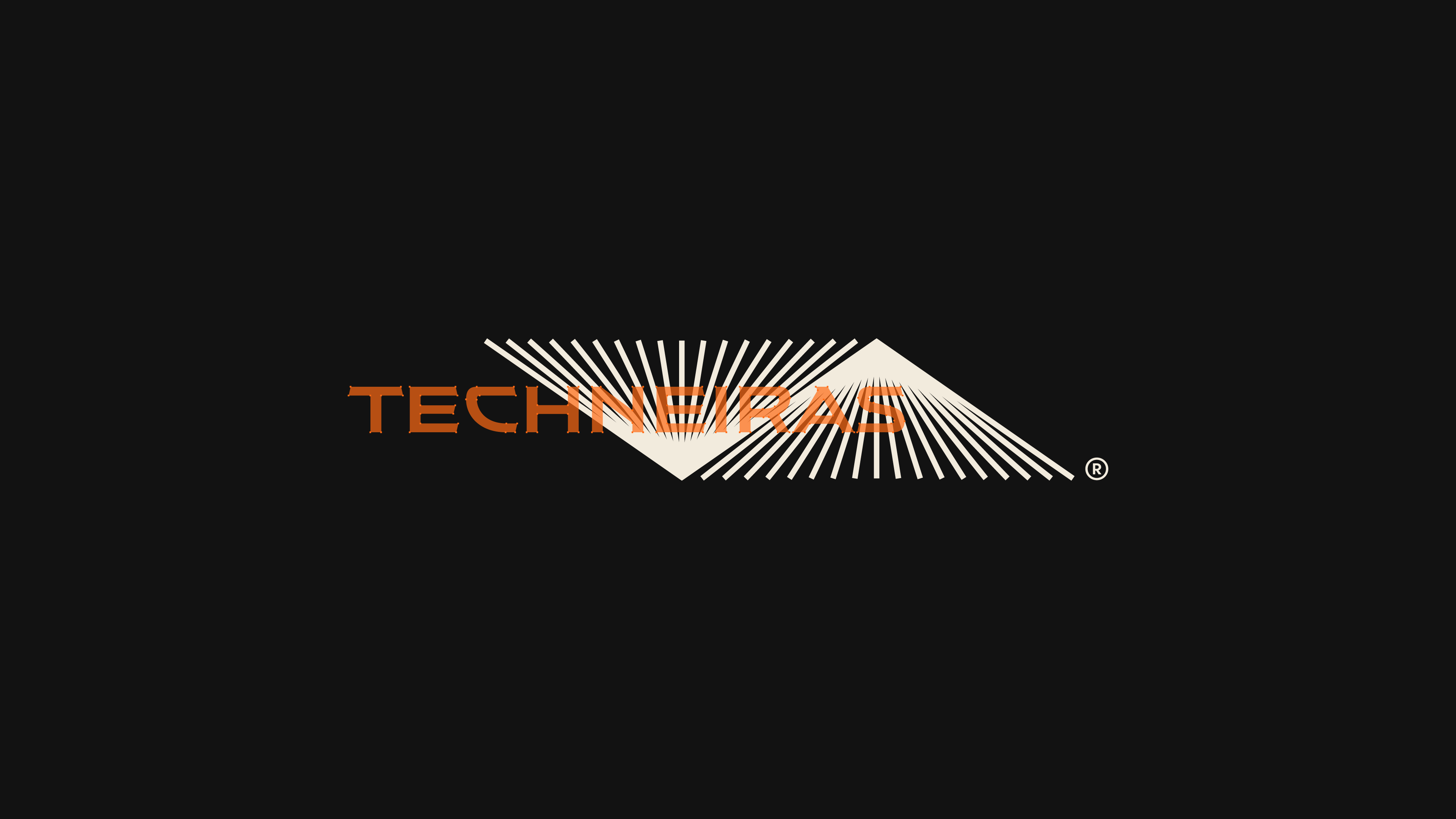
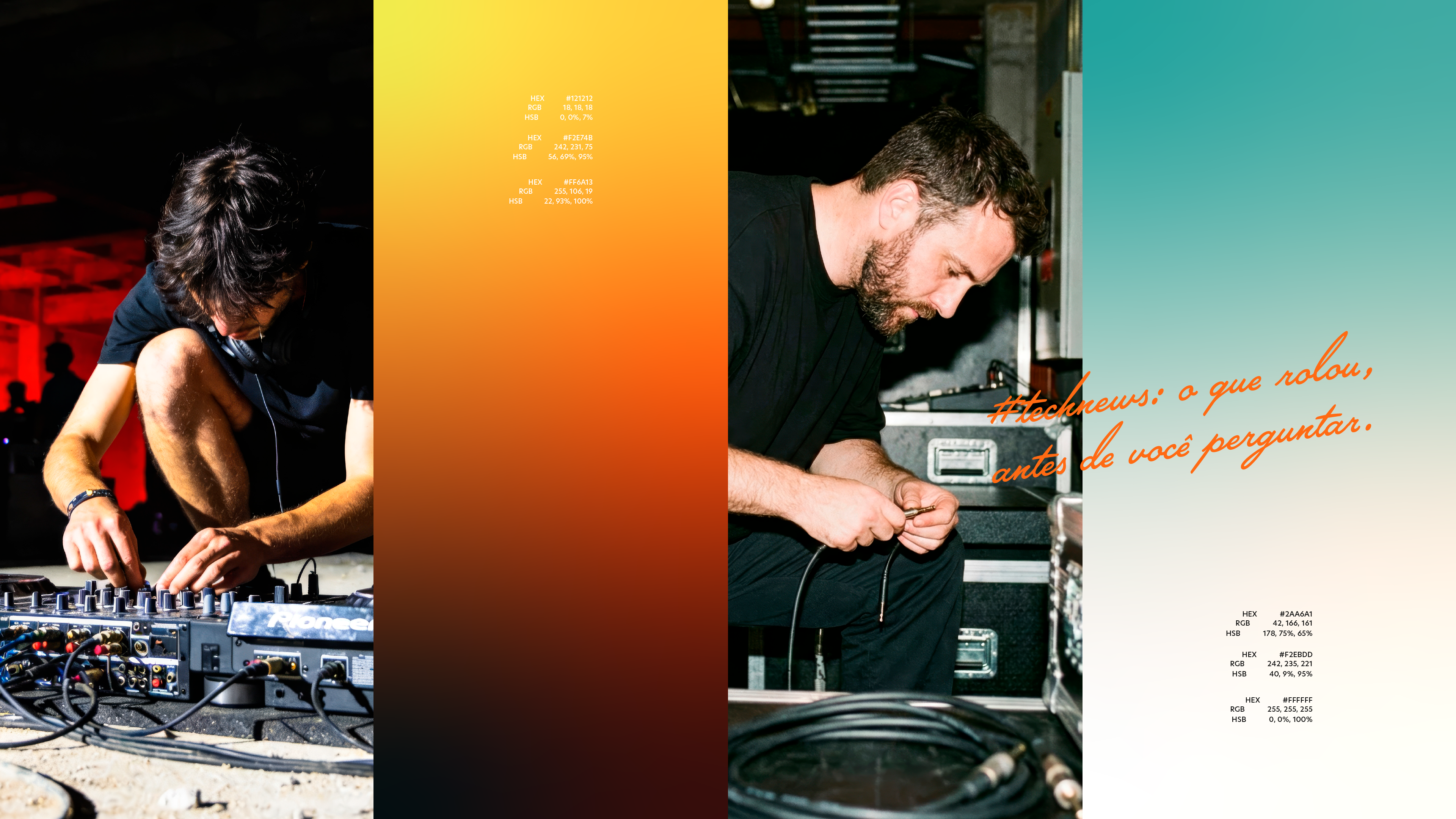
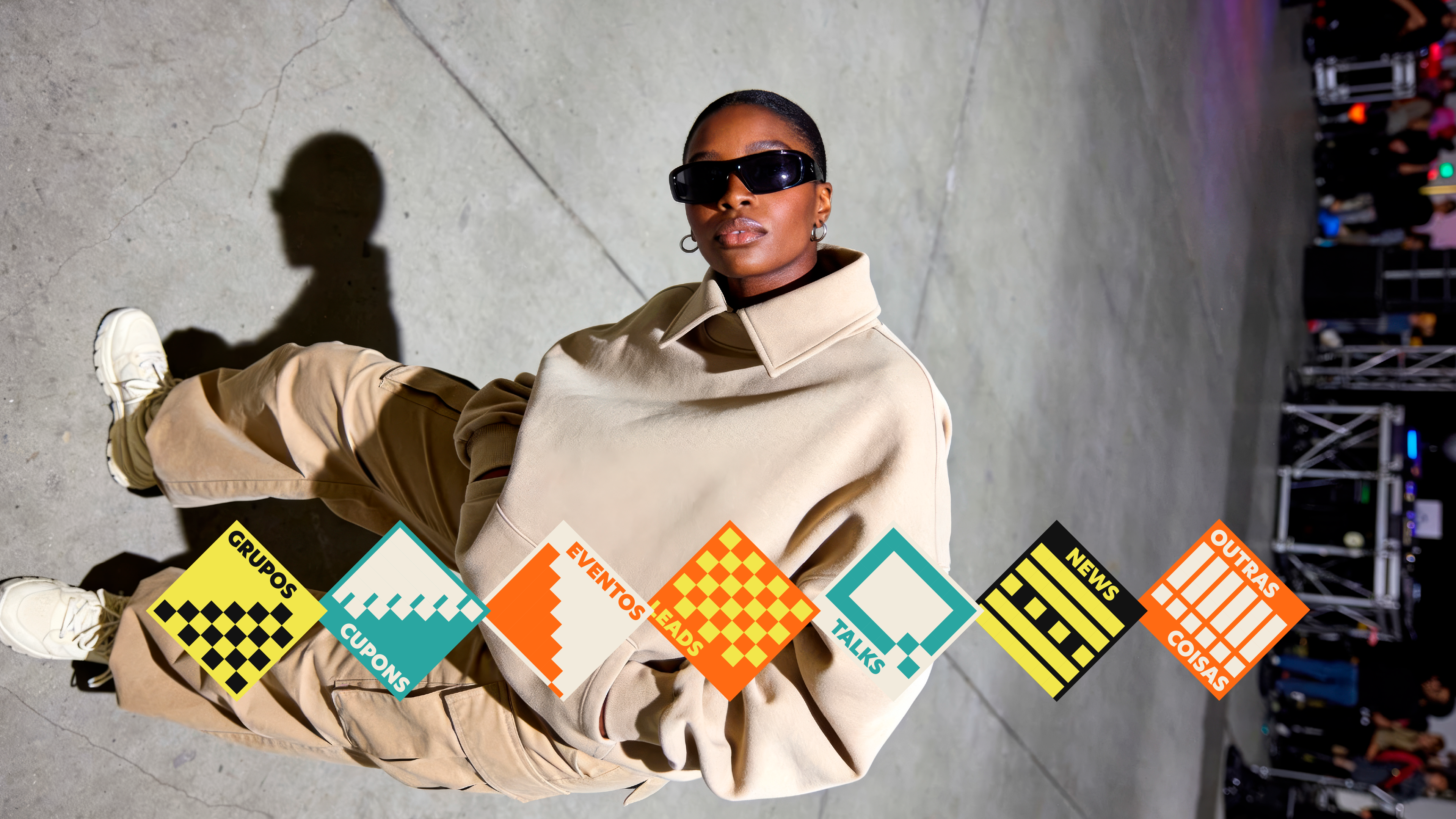
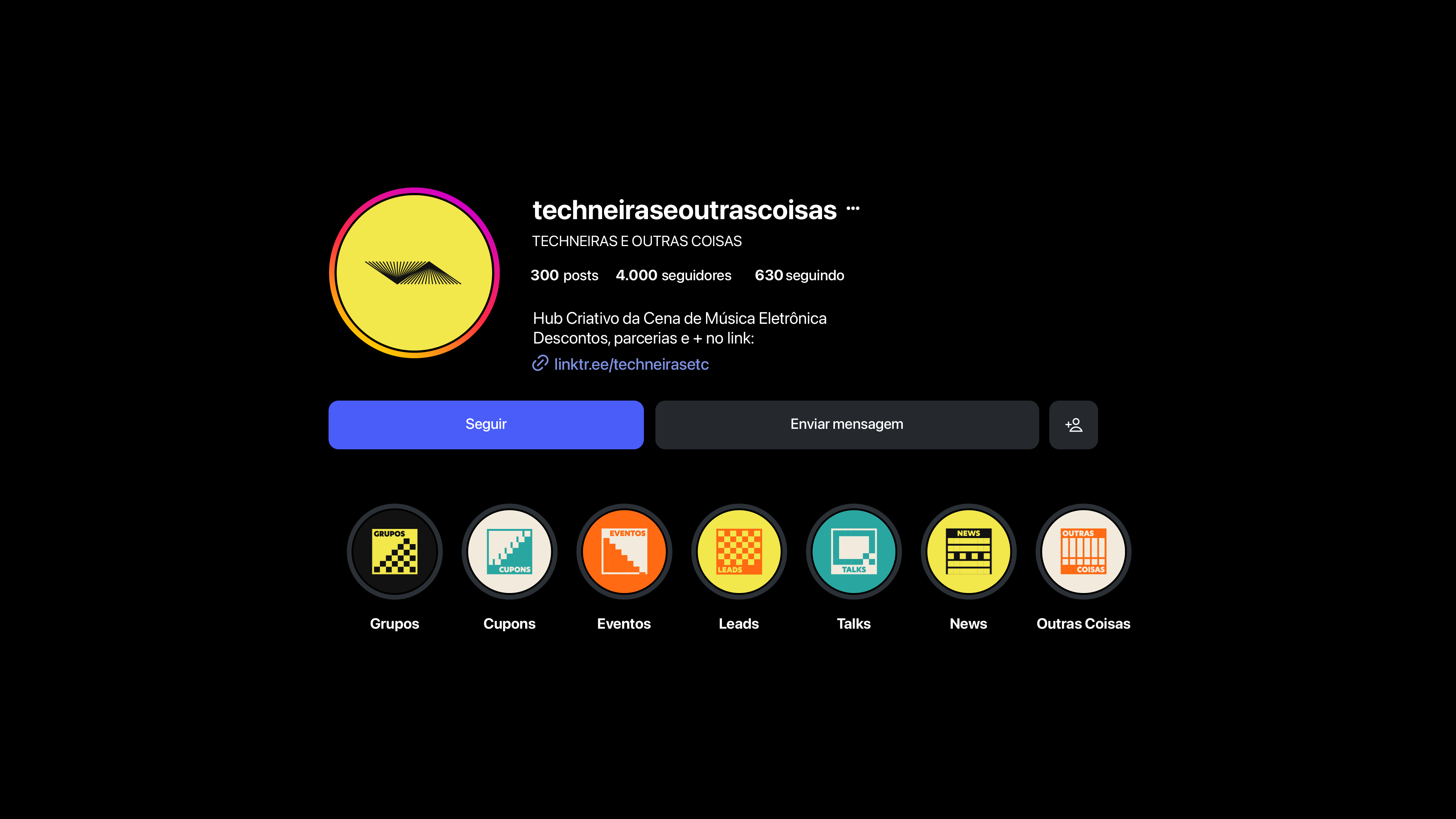
A resposta foi uma identidade moderna, neutra e exuberante na medida certa, ancorada em três pilares de personalidade. A paleta ganhou o laranja como cor de destaque, com contraste e variações de tom. A tipografia New Hero reforça o caráter jornalístico contemporâneo, com estrutura geométrica e leitura clara em caixa alta. Um sistema de ícones organiza o universo da marca em Grupos, Cupons, Eventos, Leads, Talks, News e Outras Coisas.
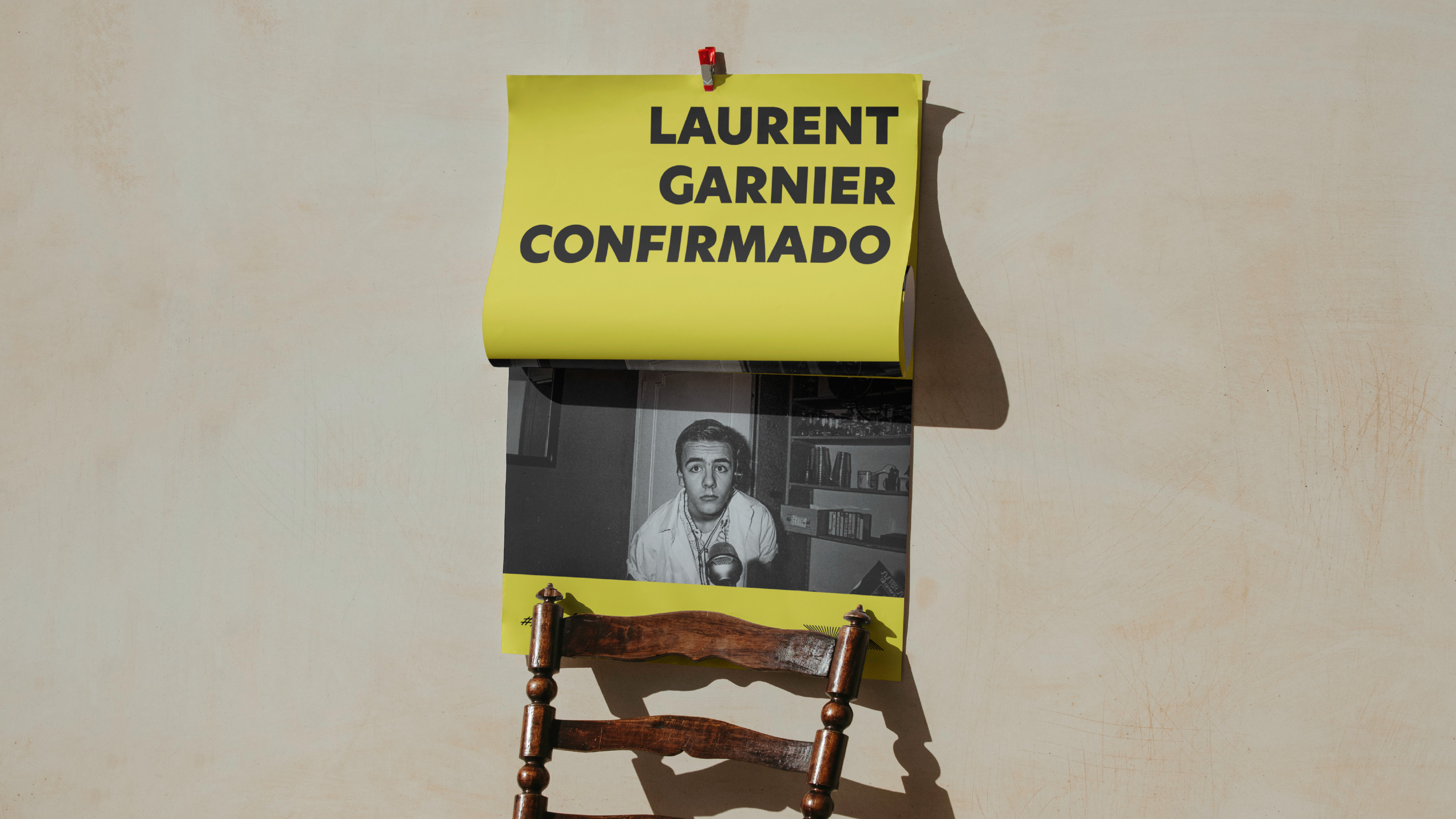
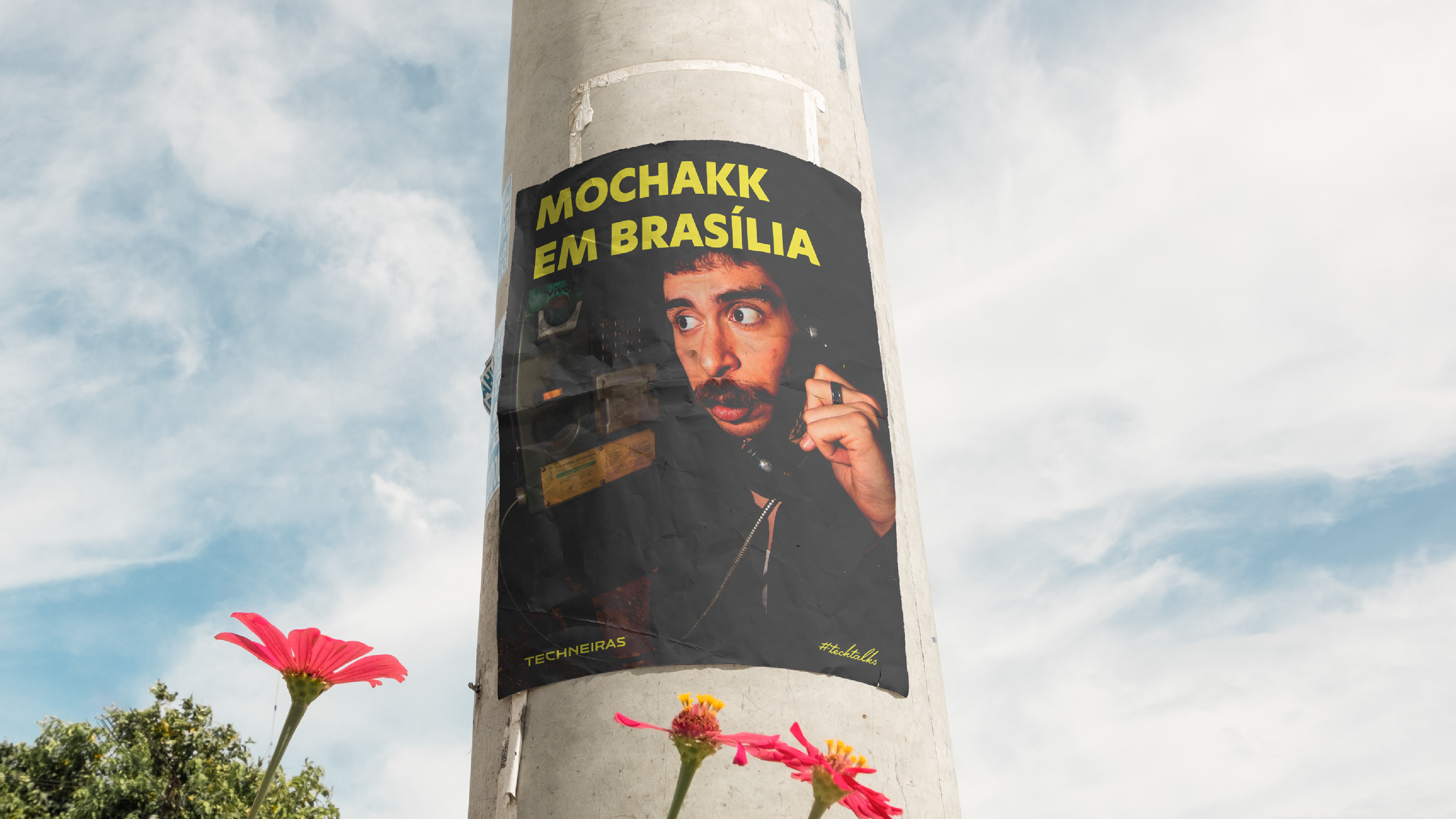
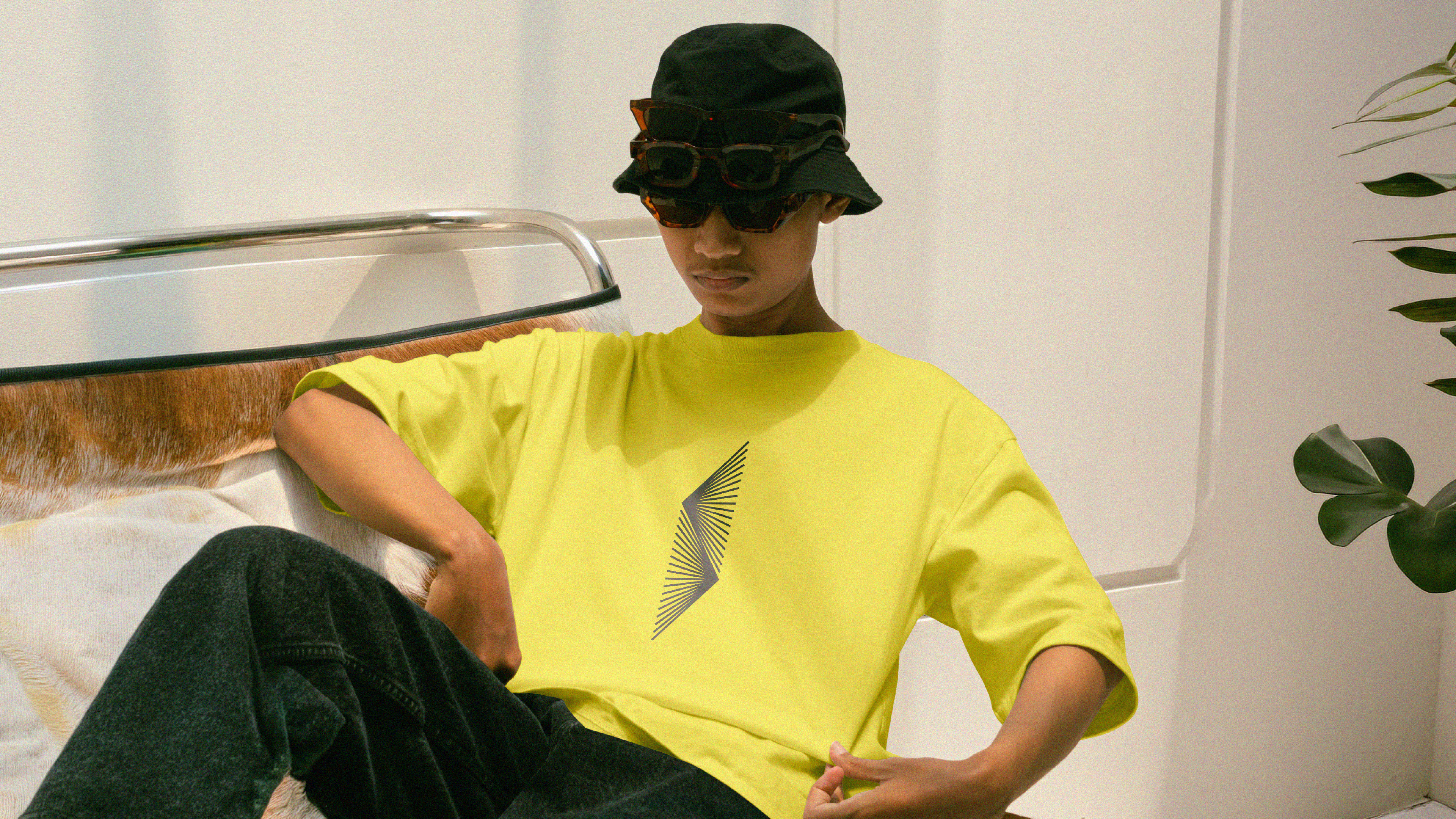
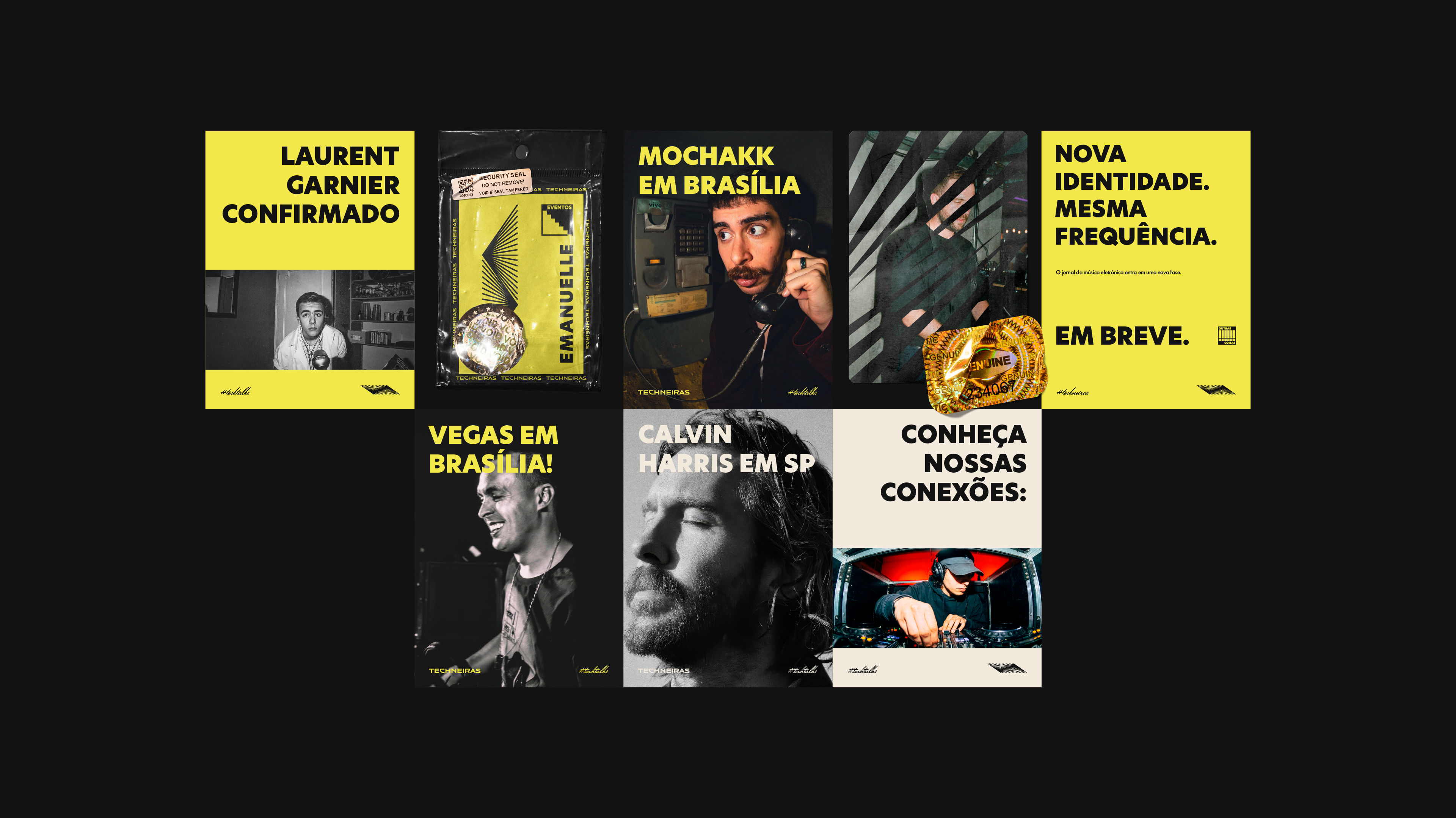
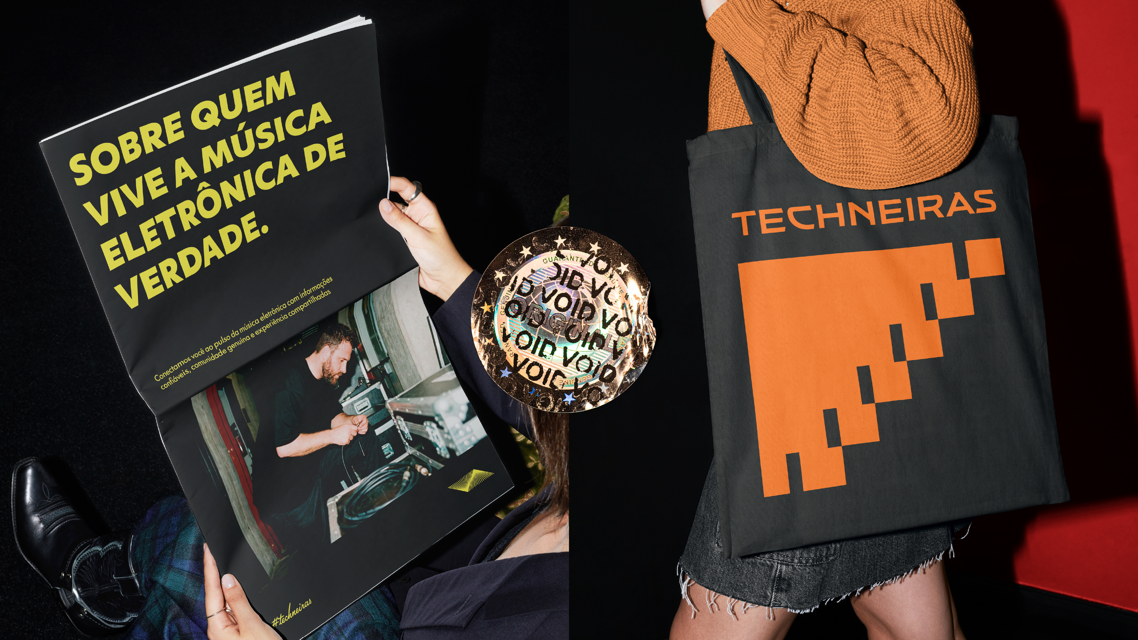
O resultado é um sistema versátil, que funciona do feed ao impresso. Ele traduz a pulsação da pista com a credibilidade de um jornal. Techneiras. A cena se move com a gente.
[EN]
Branding for Brazil's electronic music newspaper
Techneiras was born in Brasília in March 2024 as a women's community for electronic music lovers. Over time, it grew into a digital creative hub that brings together news, entertainment and community. It connects audiences, event producers and brands, with special attention to regions outside the São Paulo–Rio axis.
The challenge was to redesign the identity to match that evolution. The brand needed to leave behind the feminine codes of its earlier phase, such as purple and pink, and become neutral, inclusive and professional. At the same time, it could not lose the energy and underground spirit of the scene.
The answer is a modern, neutral and just-the-right-amount-of-exuberant identity, built on three personality pillars. The palette adopts orange as its highlight color, with contrasting tints and tonal variations. The New Hero typeface reinforces the brand's contemporary journalistic character, with a geometric structure and clear legibility in all caps. An icon system organizes the brand's universe into Groups, Coupons, Events, Leads, Talks, News and Other Things.
The result is a versatile system that works from the feed to print. It translates the pulse of the dance floor with the credibility of a newspaper. Techneiras. The scene moves with us.